
Stop Shipping AI Slop
Purple gradients, centered headlines, emoji cards. You know the AI look. Learn the prompting moves and Claude skills that make your landing pages, app mockups, and posters look expert-made instead, with real before-and-after proof.
You already know the look
Purple gradient. Centered headline that says nothing. Three little rounded cards with emoji on top. You have seen it a thousand times, and now so has everyone else.
There is a word for this now. In December 2025, Merriam-Webster named "slop" its Word of the Year, defining it as digital content of low quality produced in quantity by artificial intelligence. Australia's Macquarie Dictionary went a step further and picked "AI slop" as its 2025 word, winning both the committee and the public vote. When dictionaries are naming your output, the look has a reputation problem.
For a business, that reputation costs money. A landing page that screams "made in ten seconds" tells a visitor you put in ten seconds of care. The irony is that the tools are good enough now to produce genuinely beautiful work. The slop is not a limitation of the model. It is a limitation of how most people ask.
This guide fixes that. You will see why AI design collapses toward the same bland template, then you will learn four techniques that pull it back out, with real before and after builds you can inspect. Everything here is built around Claude, because Claude lets you install design skills that do a lot of this work for you.
The one idea: AI gives you the statistical average of everything it has seen. Your job is to drag it away from average and toward something specific. That is the whole game.
Why it all looks the same
A model builds an image or a page by predicting the most likely next piece, given everything in its training data. Ask for "a nice landing page" with no other direction, and it does exactly what you asked: it returns the most likely landing page. The safe center. The average of a million tutorials and templates.
Designers have a name for this drift toward the middle. It is convergence, and it is measurable. A 2025 study published in the journal Patterns ran 700 automated generation trajectories, looping image and text models against each other across many settings. No matter where they started, the runs collapsed toward roughly twelve generic, "commercially safe" motifs the authors called visual elevator music. Stormy lighthouses. Ornate cathedral interiors. Moody city streets at night. Pretty, forgettable, and identical.
The same gravity pulls web and app design. The training data is full of a few safe defaults, so those become the model's reflex: the Inter typeface, Tailwind's stock styles, the generic SaaS hero. Left alone, every generator reaches for them. Here are the fingerprints to watch for.
None of these are wrong on their own. The problem is that they arrive together, by default, unasked for. Recognizing them is step one, because you cannot fix a pattern you cannot see.
See it for yourself: a landing page
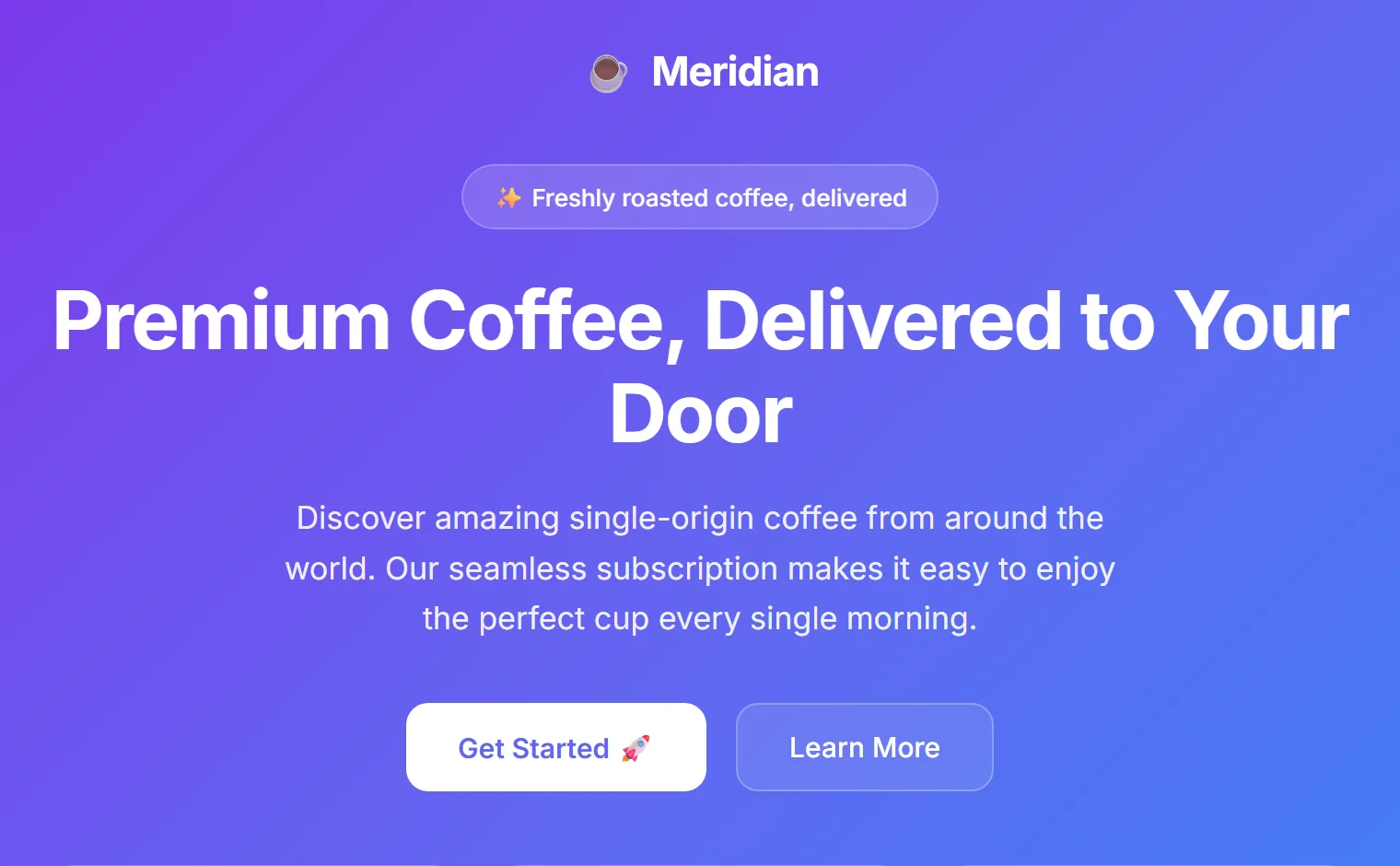
Here is the same product, a single-origin coffee subscription called Meridian, built two ways. On the left, the lazy prompt. On the right, the art-directed one. Both are real, working HTML. Look before you read on.
 Centered stack, purple gradient, emoji cards. Competent and completely generic.
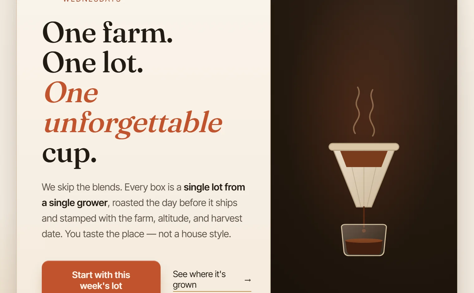
 Same content, art-directed: editorial serif, a warm roaster palette, an asymmetric layout.
The content is identical. The difference is direction. Here is what actually changed:
- Type: the single-weight Inter became a real pairing, an italic Fraunces display serif for the wordmark and headline against a clean Inter Tight body, which creates hierarchy instead of one flat voice.
- Color: the purple-to-blue gradient is gone, replaced by a warm oat-paper canvas, deep espresso ink, and one confident terracotta accent. A real roaster palette.
- Layout: the dead-centered stack became a bordered card frame with a hairline top bar and an asymmetric two-column hero, copy on the left beside a dark visual panel.
- Detail: three emoji cards gave way to a bespoke SVG pour-over and a floating paper "lot ticket" with farm, altitude, harvest, and cup score, plus fine hairlines, layered shadows, and a faint grain.
- Copy: "Premium coffee, delivered" became a point of view, "One farm. One lot. One unforgettable cup.", with a real price and a clear "skip any week" promise.
And the prompts behind each. The gap between these two is the gap between the two designs.
Technique 1: Direct it like an art director
Notice what the good prompt did. It never said "make it nice." It made decisions. A real art director does not hand a designer a vibe. They hand over constraints: this typeface, this palette, this mood, this layout, this voice. Constraints are not the enemy of creativity here. They are the thing that pulls the model off the average.
Break your direction into the dimensions a designer actually controls, and specify each one on purpose:
Two moves matter most. First, commit to one bold aesthetic direction before anything else: editorial, brutalist, warm and organic, retro-futuristic, luxury, whatever fits. A specific direction beats a tasteful blur every time. Second, ban the defaults by name. "No purple or blue gradient, no emoji icons, no rounded corners above 8px, no three-card grid." Models follow explicit prohibitions well, and these four cut most of the slop on their own.
The trap: "Make it modern and clean" is the single most expensive phrase in AI design. To a model, modern and clean is the purple-gradient template. Specific words get specific results. Vague words get the average.
Technique 2: Steal like an artist
The fastest way to escape the average is to point at something that is not average. Designers do not invent in a vacuum. They collect references, then borrow structure, palette, and mood from work they admire. You can do the same, and hand those references straight to Claude.
Spend ten minutes before you prompt. Pull up real work on sites like Dribbble, Awwwards, or the portfolios of studios whose taste you trust. Find two or three pieces that feel right and get specific about why. Is it the tight editorial typography? The muted palette with one loud accent? The way nothing is centered? Then name those qualities in your prompt, or describe the reference directly: "in the spirit of a 1950s Blue Note record sleeve."
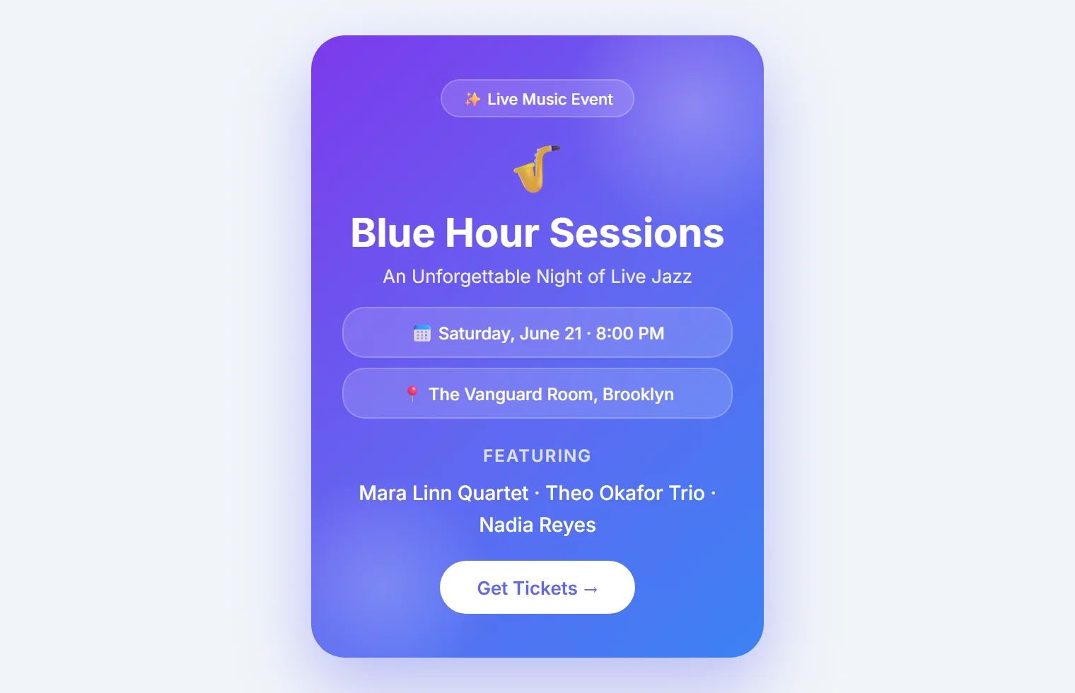
Posters live and die on this. Watch what a single, strong reference does to the same jazz night:
 Generic gradient, centered text, a "Get Tickets" pill. It could be selling anything.
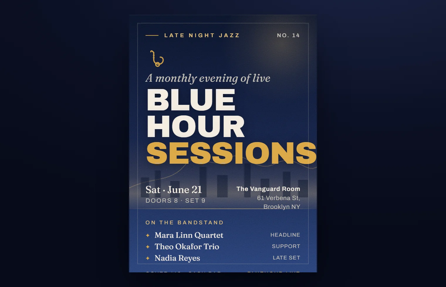
 A midnight-blue Blue Note bill: stacked display type, a brass accent, a real horizon.
- Type: Inter became Archivo Black for a huge stacked uppercase title, with the last word in brass, and italic Fraunces for the date and lineup.
- Palette: the purple gradient became a midnight-blue wash lit by a single warm brass accent. A cohesive, expensive scheme instead of generic violet.
- Composition: centered symmetry gave way to a bottom-weighted layout, the title pinned low, an asymmetric two-column meta block for date and venue.
- Texture: film grain, an inner hairline frame, a thin brass horizon line, and an abstract skyline replaced the flat glassmorphism.
- Detail: the emoji and the generic ticket button became a typographic mark, role tags, and concrete lines like "Doors 8, Set 9" and "Cover $18, Cash Bar."
Pro tip: reference the medium, not just the style. "A gig poster in the spirit of a 1950s Blue Note bill" carries a whole world of type, color, and composition in one line. A good reference is worth a paragraph of adjectives.
Technique 3: Install skills that bake in taste
Prompting well works, but it asks you to remember every rule every time. The better move is to make good taste the default. In Claude, you can do that with skills: small instruction packs that load automatically when they are relevant and steer every build toward expert decisions. Think of them as a designer's standards living inside the tool.
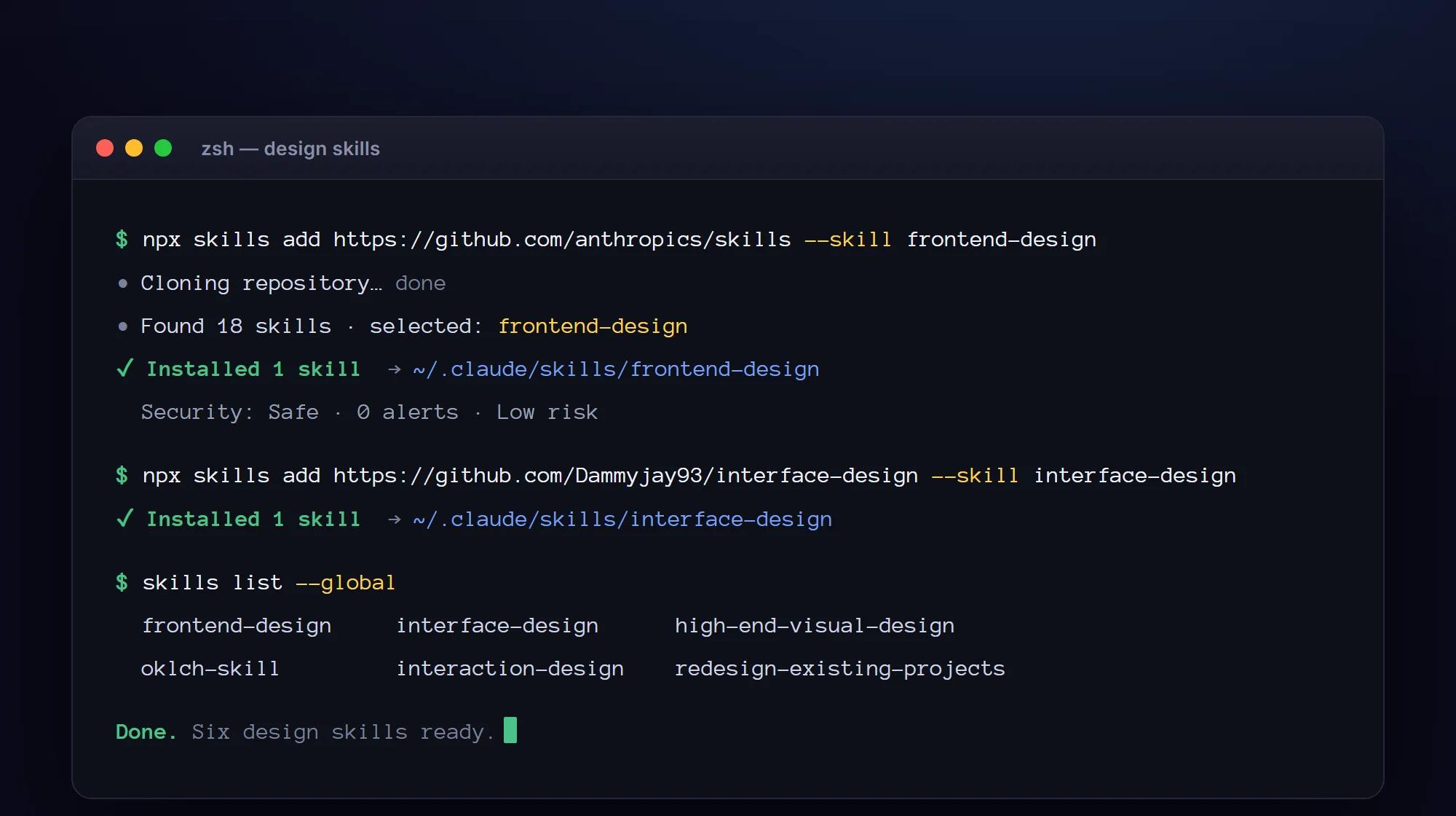
There is a whole directory of them at ui-skills.com, curated for design and front-end work. You install one with a single command in your terminal. The format is the same every time:
npx skills add https://github.com/anthropics/skills --skill frontend-design
A handful of these, working together, cover most visual work. Here is a starter set worth installing:
| Skill | What it does for you |
|---|---|
| frontend-design | The anti-slop generator. Forces a bold aesthetic direction and bans the generic defaults. Good for almost anything visual. |
| interface-design | Built for dashboards, admin panels, and app UI, where consistency and hierarchy matter most. |
| high-end-visual-design | An "expensive agency" layer: the fonts, spacing, and shadows that make work feel premium. |
| oklch-skill | Builds real color systems and dark modes that are even and accessible, not hand-guessed. |
| interaction-design | Purposeful motion and hover states, so things feel crafted instead of static. |
| redesign-existing-projects | An audit pass that hunts down and fixes AI-slop fingerprints in work you already have. |
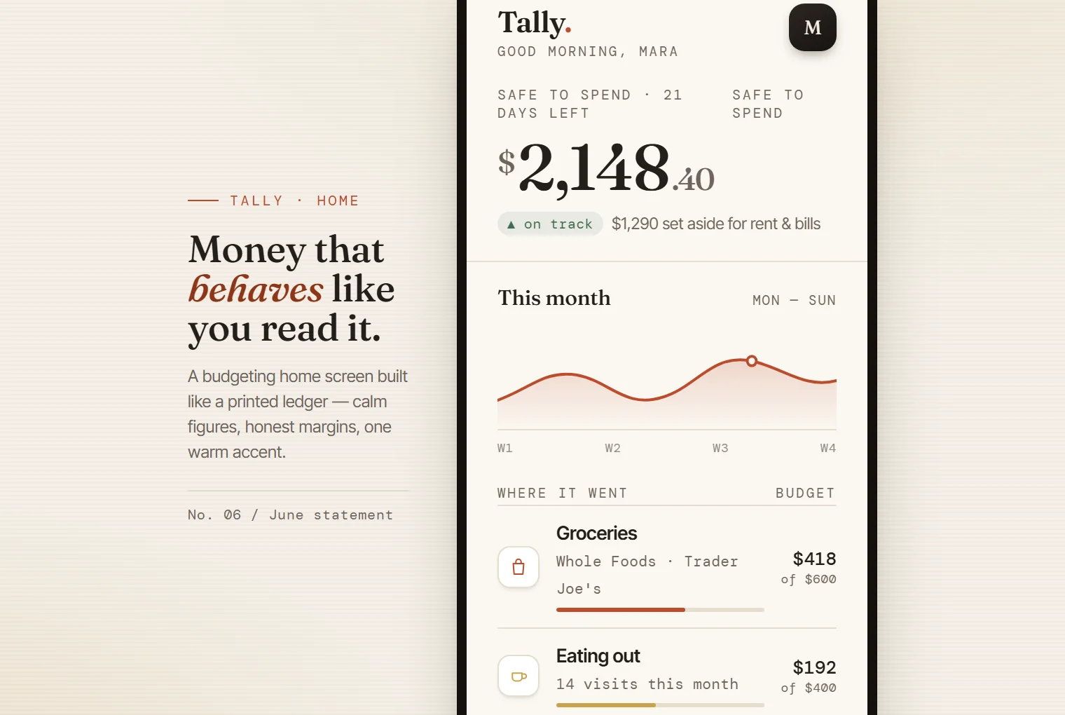
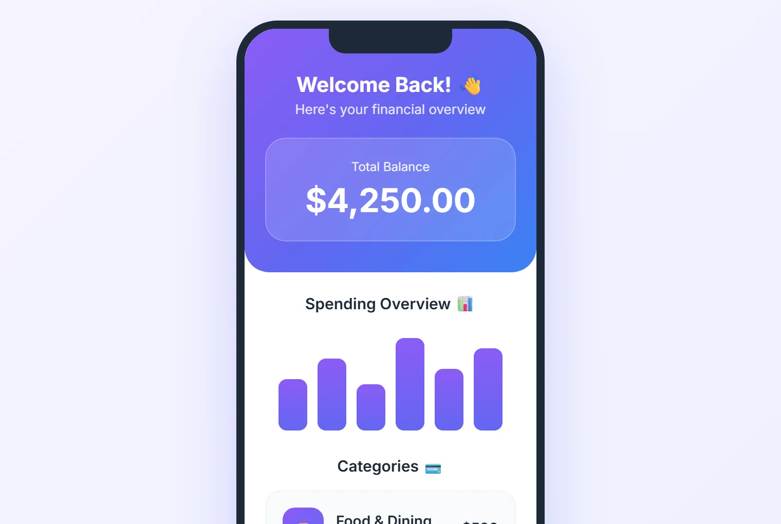
Once installed, you barely think about them. Ask Claude to build a budgeting app screen and the design skills load on their own. Here is the Tally app, the lazy way versus a skill-driven build:
 Purple header, emoji categories, gradient bars. A template with a logo dropped in.
 A printed-ledger look: a serif balance, a tuned chart, a real transaction list.
- Type: one Inter weight became a trio, a Fraunces serif for the balance figure, Inter Tight for body, and a mono for labels and amounts.
- Color and texture: the purple gradient and glassmorphism became warm ink on cream paper, one burnt-sienna accent, fine grain, and soft warm shadows.
- Layout: the centered welcome banner became an offset editorial caption beside the phone, with a left-aligned oversized balance.
- Data: identical gradient bars became a hand-tuned area chart, and emoji categories became a real ledger with vendor names and budget meters, one deliberately over budget.
- Detail: 1px hairline rules instead of stacked cards, a quiet line-icon nav, and concrete copy like "Over by $30, ease up."
Best practice: install one strong generator and one audit skill first, then add a color or motion skill as you need them. Do not stack two opinionated "look" skills at once. They fight over fonts and color, and the result gets muddy.
Technique 4: Run an anti-slop audit
Even a good build benefits from a second pass with fresh eyes. This is where an audit skill earns its place. After Claude generates something, point a skill like redesign-existing-projects at the result and it will scan for the exact fingerprints from Section 02: the default font, the purple accent, the centered hero, the cliche cards, the buzzword copy. Then it proposes specific fixes, in order of impact.
The mindset shift matters more than any single tool. Treat the first output as a draft, never the final. The research is consistent on this point: human judgment on top of AI output is what separates good work from slop. The model gets you to a competent draft fast. You, or a skill carrying your standards, push it past the average.
One command to route it all
Once you have a few skills installed, a natural next step appears. You can write your own small "orchestrator" skill, a single command like /design that asks what you are making, then routes the job to the right skills automatically. Building a landing page? It reaches for the generator and the premium layer. A dashboard? It pulls in the interface skill. Either way it finishes with the audit pass.
You do not need this to get great results, and it is a more advanced move, so treat it as a goal rather than a starting point. The point is the principle: once your taste lives in skills, you can wire them together so you never have to remember which one to use. You describe the outcome, and the system handles the craft.
Where this goes: the more of your standards you encode into skills, the less your output depends on remembering to prompt well on a tired Tuesday. Good defaults beat good intentions.
Your anti-slop checklist
Keep this next to you. Each row is a tell from the left-hand side of every comparison above, paired with the fix from the right.
| The slop tell | The fix |
|---|---|
| Inter or system font everywhere | Pair a distinctive display font with a clean body font |
| Purple-to-blue gradient | One dominant color plus one or two sharp accents, gradient banned by name |
| Centered, symmetric stack | An asymmetric layout, a grid, or a frame with real rhythm |
| The three-icon card grid | Vary the components, flatten the nesting, let spacing do the work |
| Uniform 16px radius and one shadow | Considered radii and layered shadows for actual depth |
| Emoji used as icons | Simple inline SVG or typographic marks |
| Buzzword copy | A real point of view and concrete, specific words |
| Full-width body text | Cap the measure near 65 to 75 characters for readability |
Taste is the part that is still yours
The models will keep getting better at producing the average. That is exactly why the average is worth nothing. When anyone can generate a competent purple-gradient page in ten seconds, the competent purple-gradient page stops being worth anything at all. The value moves to the part the model cannot supply on its own: a specific point of view, applied with care.
You do not need a design degree to supply it. You need to direct instead of ask, to borrow from work you admire, to install a few skills that carry good standards, and to treat the first draft as a draft. That is the entire difference between the left side and the right side of every example here.
Start small. Take the last thing you made that looked a little too much like everyone else's, install frontend-design and redesign-existing-projects, and run the audit on it tonight. You will see the slop you stopped noticing, and you will know exactly how to fix it.