
Landing Page Design Prompts
Your first AI-built landing page usually breaks for the same six reasons. Here's what to get right before you hit enter, plus 10 real prompts and live builds you can copy.
A one-shot prompt is when you describe a whole page in a single message and let a tool like Lovable, Bolt, Cursor, v0, or Base44 build it in one pass. When it works, it feels like magic. When it falls apart, it's almost always for the same handful of reasons, and none of them are about your idea. They're about the details you left out.
This is a short walk through what to decide before you hit enter the first time. Get these right and your first build starts close to what you imagined, instead of a gray box with broken pictures and the wrong font.
Decide the look before you write a word
The tool builds what you describe, not what you see in your head. So spend five minutes getting clear first. Find one or two pages you genuinely like and notice the feeling: clean and minimal, dark and bold, soft and playful. Pick your colors, choose one main font, and decide whether the page is light or dark. That tiny bit of upfront thinking saves you a pile of redo prompts later.
Pro Tip: Keep a folder of screenshots you love. You can paste one into the chat and say "match this style" right alongside your written prompt. A picture closes the gap between what you mean and what the tool guesses.
Fonts are the first thing that breaks
The font carries a huge amount of the feel, and it's also the most common thing that goes wrong. There are two traps. The first is premium fonts. Some of the best-looking ones (the PP family from Pangram Pangram is a good example) are free to try for personal projects but need a paid license once you use them for business, and a prompt may point at a copy sitting on a stranger's website that can disappear at any time.
The second trap is the missing file. A prompt will sometimes load a font from a local file, something like /MyFont.woff2, that was never actually included in your project. The build quietly falls back to a plain default, and the whole page looks a little off without telling you why.
The fix is easy. For your first build, ask for a free Google Font and name it exactly, along with the weights you want. Kanit, Inter, Poppins, and Space Grotesk are all free for commercial use and load instantly. For example: "Use Inter from Google Fonts, weights 400 to 800."
Watch out: If your page suddenly looks generic or plain, a missing or unlicensed font is almost always the reason. Check that before you change anything else.
Borrowed images don't stay
One-shot prompts love to fill a page with images pulled from other websites. Those preview clips, looping GIFs, and AI pictures live on someone else's server. They look perfect in the first demo, then break later when that server blocks the link, swaps the file, or the address expires. Sample logos and stock photos tied to an account that isn't yours have the same problem.
So treat every image in a generated build as a placeholder, not a final asset. Plan to drop in your own photos, screenshots, or art before you share the page with anyone. On the first pass it's fine to let the borrowed images load so you can judge the layout. Just know they're temporary scaffolding, not part of the finished page.
Best Practice: Keep your real images together in one folder, sized for where they'll sit, then ask the tool to swap the placeholders for your files. Your own pictures are the single biggest upgrade from "demo" to "real."
Describe the design in numbers
"Make it modern" hands the tool too much freedom, and it will fill the gaps with its own taste. The builds that land closest to your vision spell out the small stuff: the exact colors, how round the corners are, how much space sits around things, and what the buttons feel like. You don't need a design degree for this. You just need to be specific.
Give it your background and text colors as hex codes, one accent color for buttons and links, how round you want corners (sharp, soft, or full pill shapes), and whether sections should gently fade in as you scroll. Here's the same request, vague versus specific:
| Vague | Specific |
|---|---|
| Make it pop | Background #0C0C0C, text #FFFFFF, one accent #0050B6 |
| Nice buttons | Pill-shaped buttons, white text on the accent color |
| Some animation | Fade each section up as it scrolls into view |
| A modern font | Kanit from Google Fonts, weights 300 to 900 |
The column on the right takes ten extra seconds to write and removes most of the guesswork.
Make it yours: words and links
Generated builds arrive stuffed with sample content: a fake founder story, made-up reviews, prices that aren't yours, and big-company logos used as decoration. Publish that by accident and it's confusing at best, and a trademark headache at worst. So before you call anything finished, replace every word with your own. Put in your real name, your real offer, your real prices, and links that actually go somewhere. If a button says "Book a call," make sure it points at your real booking page.
Key Point: Do one quick pass just for content. Swap the brand name, the headline, every testimonial, and every link. Borrowed words are the easiest thing to miss and the most obvious thing to a visitor.
Name your tools so it actually runs
A landing page is built from a few moving parts: the framework that runs it, the styling system that makes it look good, the icon set, and sometimes a library that handles animation. When your prompt names these parts, the build is far more likely to work on the first try. When it leaves them out, the tool guesses, and its guess won't always match the rest of the page.
You don't need to understand what each piece does. You just need to keep the names in your prompt. And here's the quiet superpower: when a prompt builds something you love, save it. Reuse the exact same tool names next time, and you'll get a result that behaves the same way instead of starting from scratch.
Give the hero its own instructions
The hero is the top of the page, the very first thing a visitor sees. It carries most of your first impression, so it deserves its own clear description instead of being lumped in with everything else. A strong hero usually does just three things: one clear headline, one short line underneath that says what you do, and one button you actually want people to press.
Pick a single focal image, or keep it text-only and let the words breathe. The temptation is to cram in five messages and three buttons. Resist it. One headline, one promise, one action. A hero that tries to say everything ends up saying nothing.
Remember: If a visitor can't tell what you do and what to click within a few seconds, the fix is usually to remove things from the hero, not add more.
See it in action
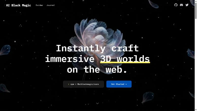
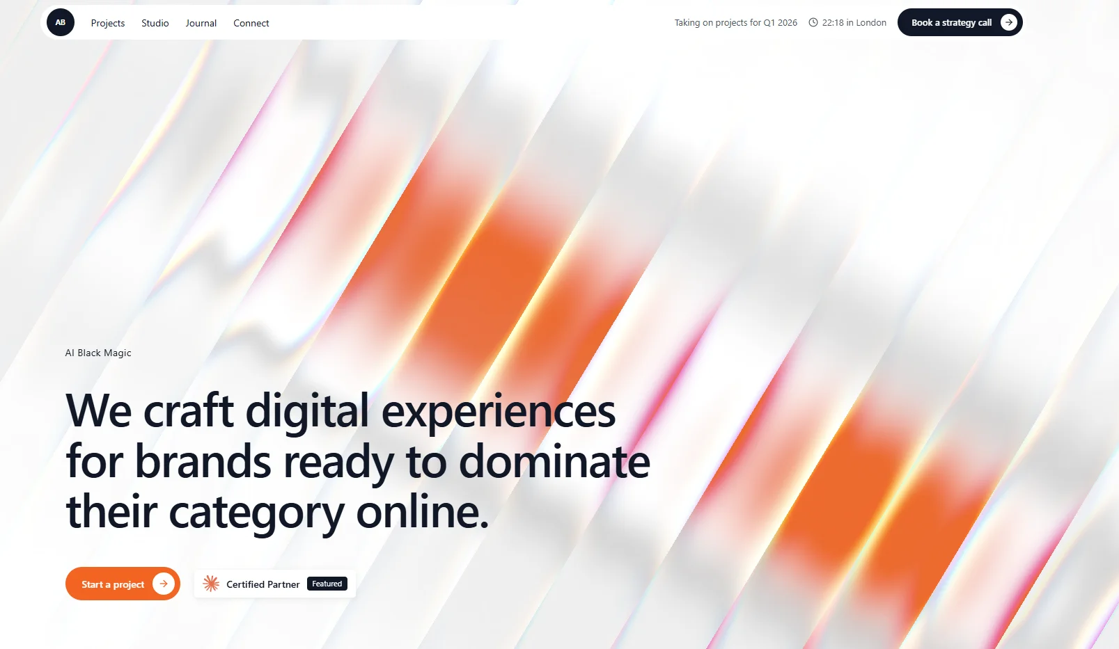
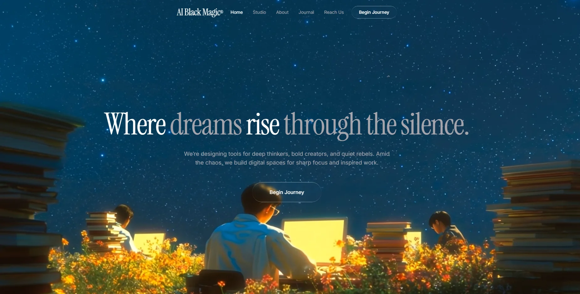
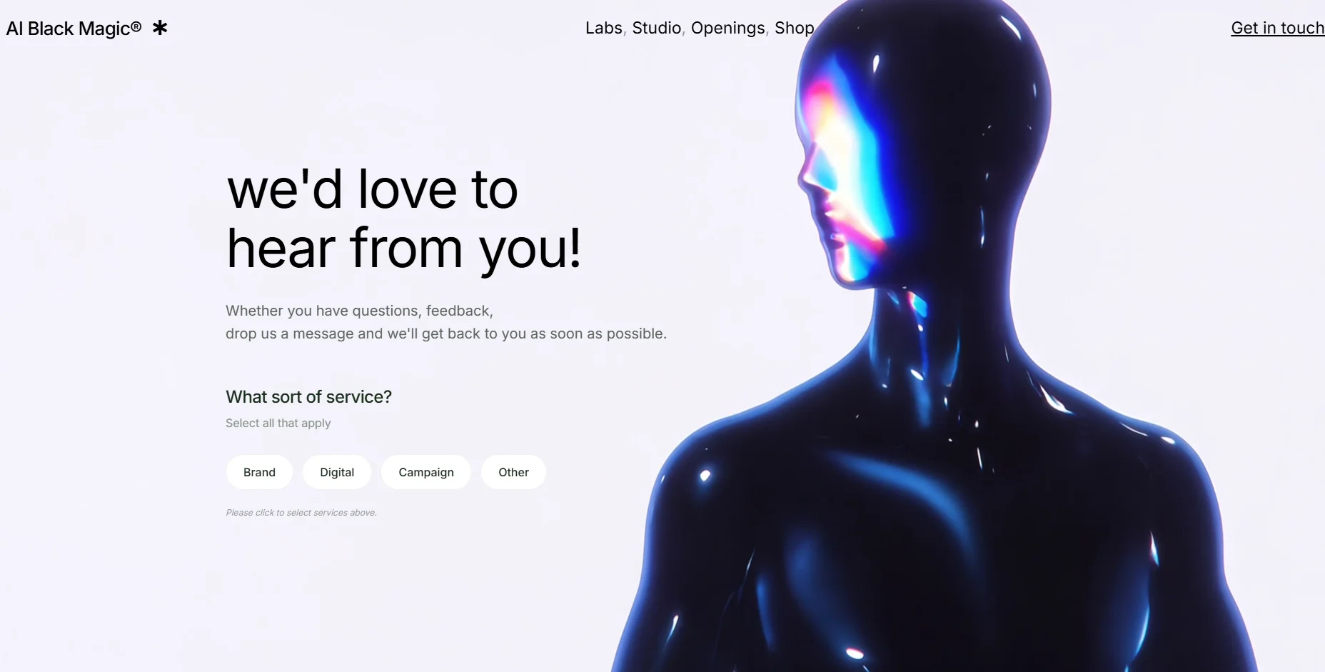
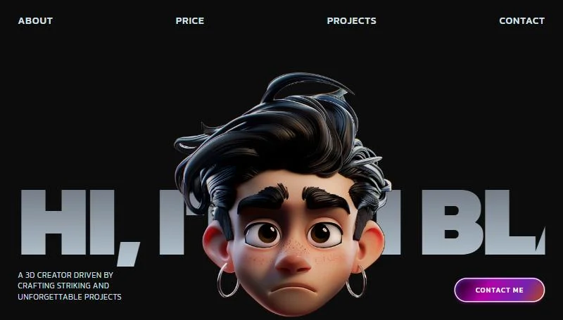
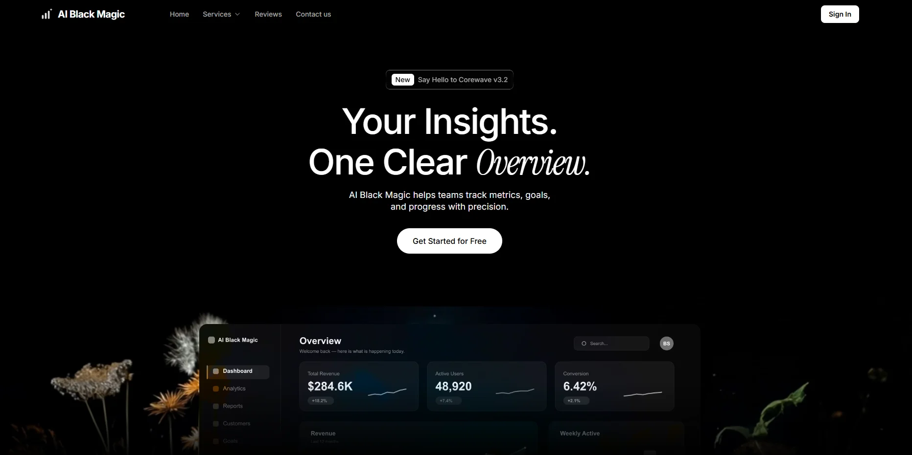
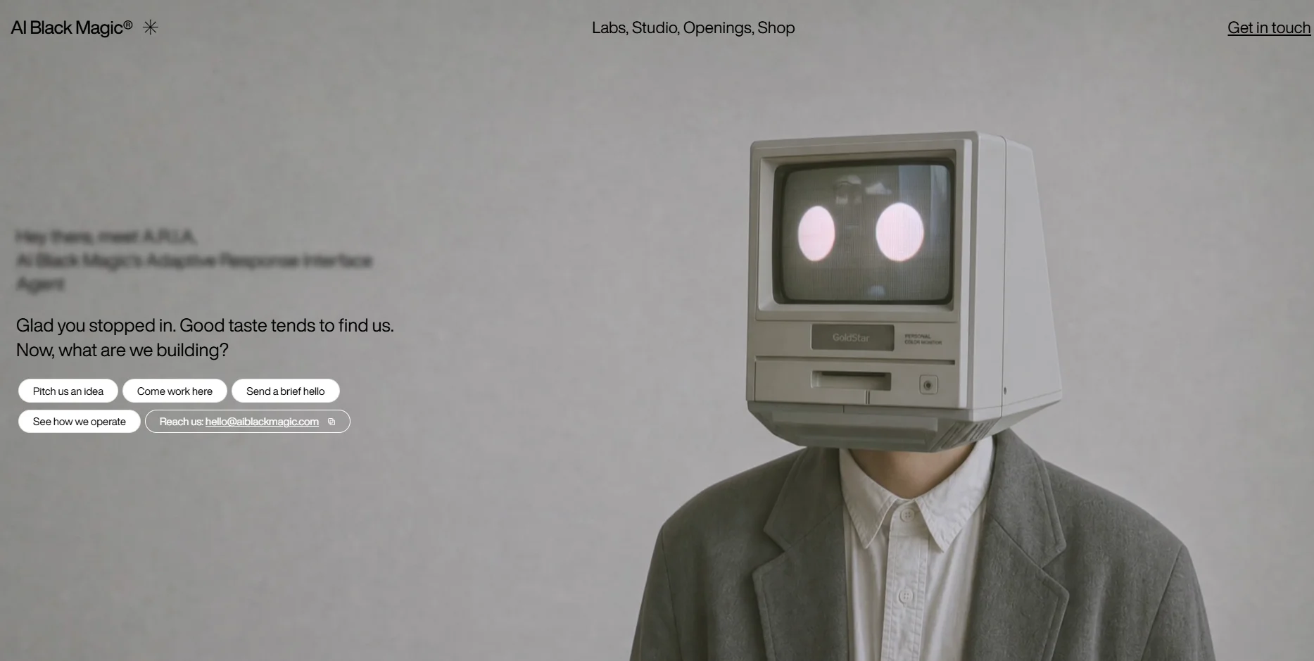
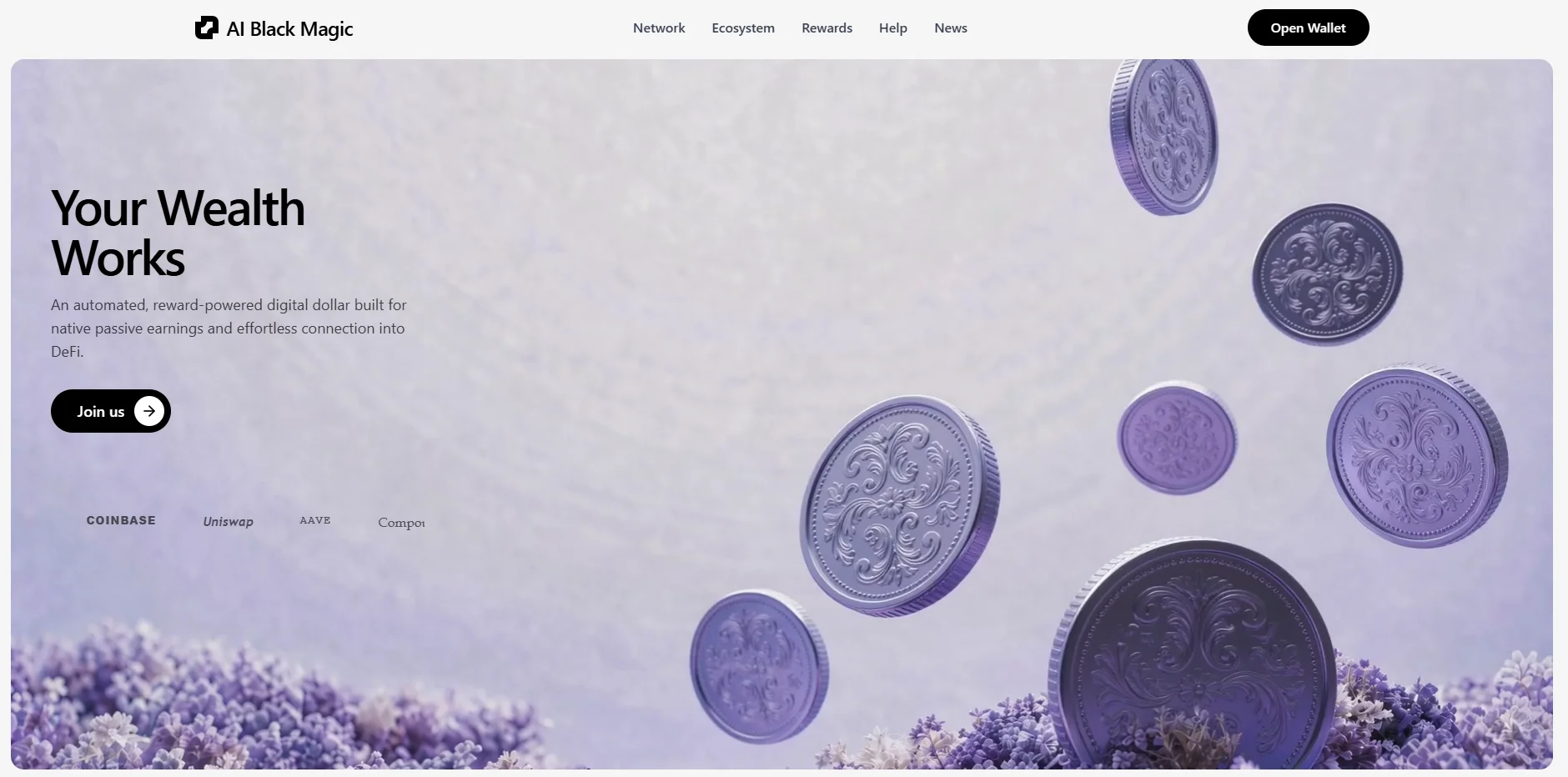
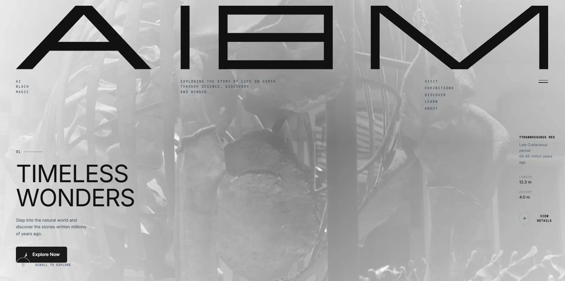
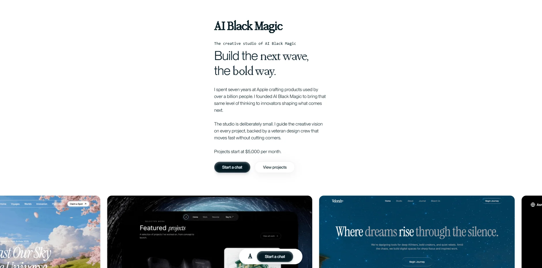
Below are ten sample builds, each made from a single prompt. For every one you get the screenshot, a link to the live build, and a button to download the exact prompt that made it. Skim the images for a look you like, open the live build to see it move, then download its prompt to read how that look was described in plain words. Watch how the specific prompts, the ones that name fonts, hex colors, and real spacing, tend to produce the cleanest pages. That connection between detail in and quality out is the whole lesson on one page.
Your first try, made better
One-shot prompting isn't about finding magic words. It's about leaving less to chance. Decide the look first, ask for a free font, treat every image as temporary, describe the design in numbers, swap in your own words, and name your tools. Do those six things and your first build lands close to right, instead of becoming something you have to rescue.
So pick one of the samples above, download its prompt, change the words to yours, and run it. Your first attempt is going to be far better than most people's tenth.