
← Back to Image & Video Prompts
Image
30 UI Design Style Guide Prompts
Generate 30 UI style guide reference sheets showcasing the visual language of different design movements — components, color palettes, typography, and interaction patterns from clean minimal to glassmorphism, neomorphism, retro 90s, brutalist, sci-fi, skeuomorphic, dark mode, and playful illustrated styles.
Image28 prompts
Prompts & Examples
Each image below was generated from the exact prompt shown next to it — copy it and swap in your own subject.
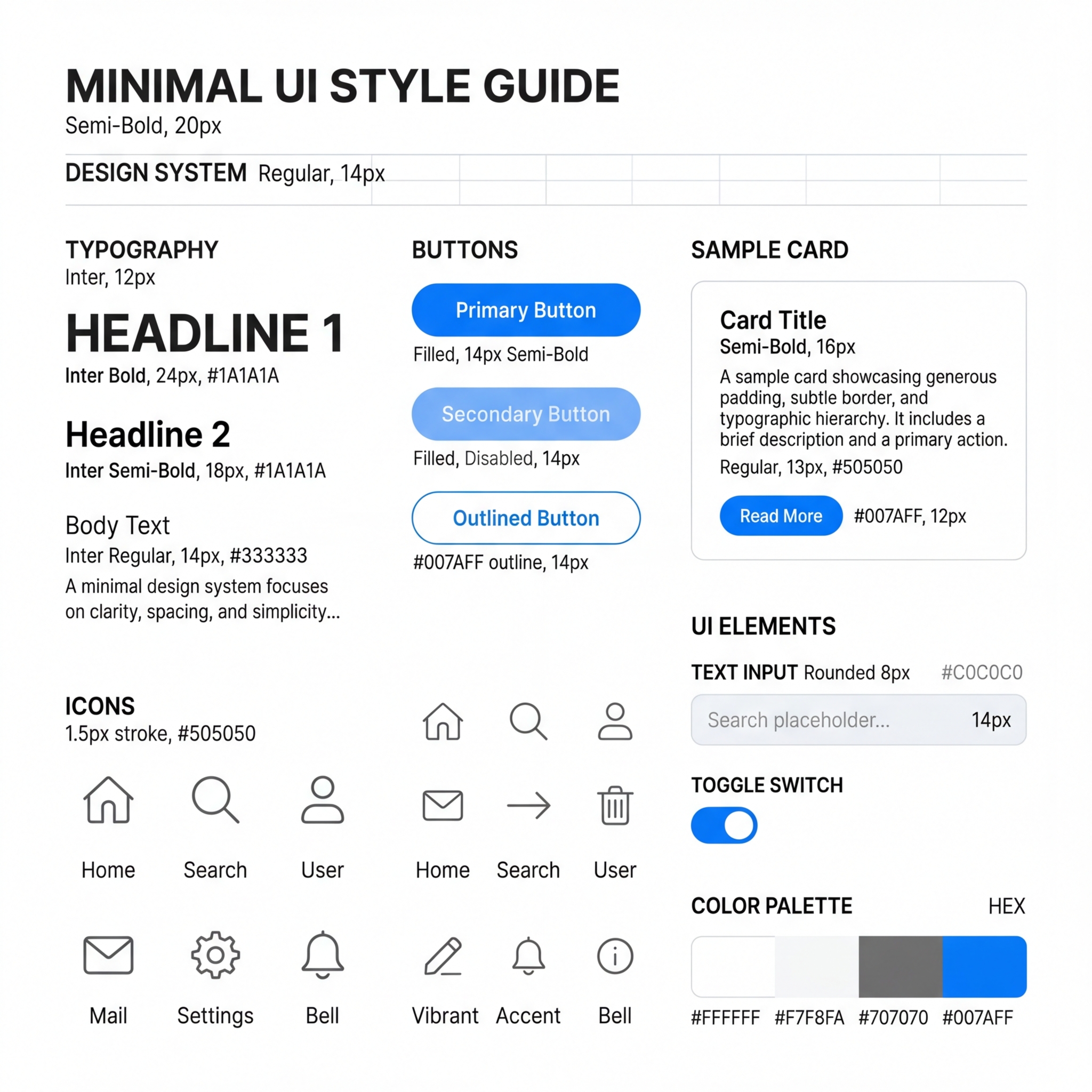
A UI style guide sheet for clean minimal design. White background with a grid of UI components arranged neatly: rounded pill buttons in a single accent color, thin-line icons, a sample card with generous padding and a hairline border, a toggle switch, a text input field with placeholder text, and a color palette strip showing white, off-white, slate grey, and one vibrant accent. Typography samples show a geometric sans-serif in three weights. Everything breathes. 1:1 square crop.
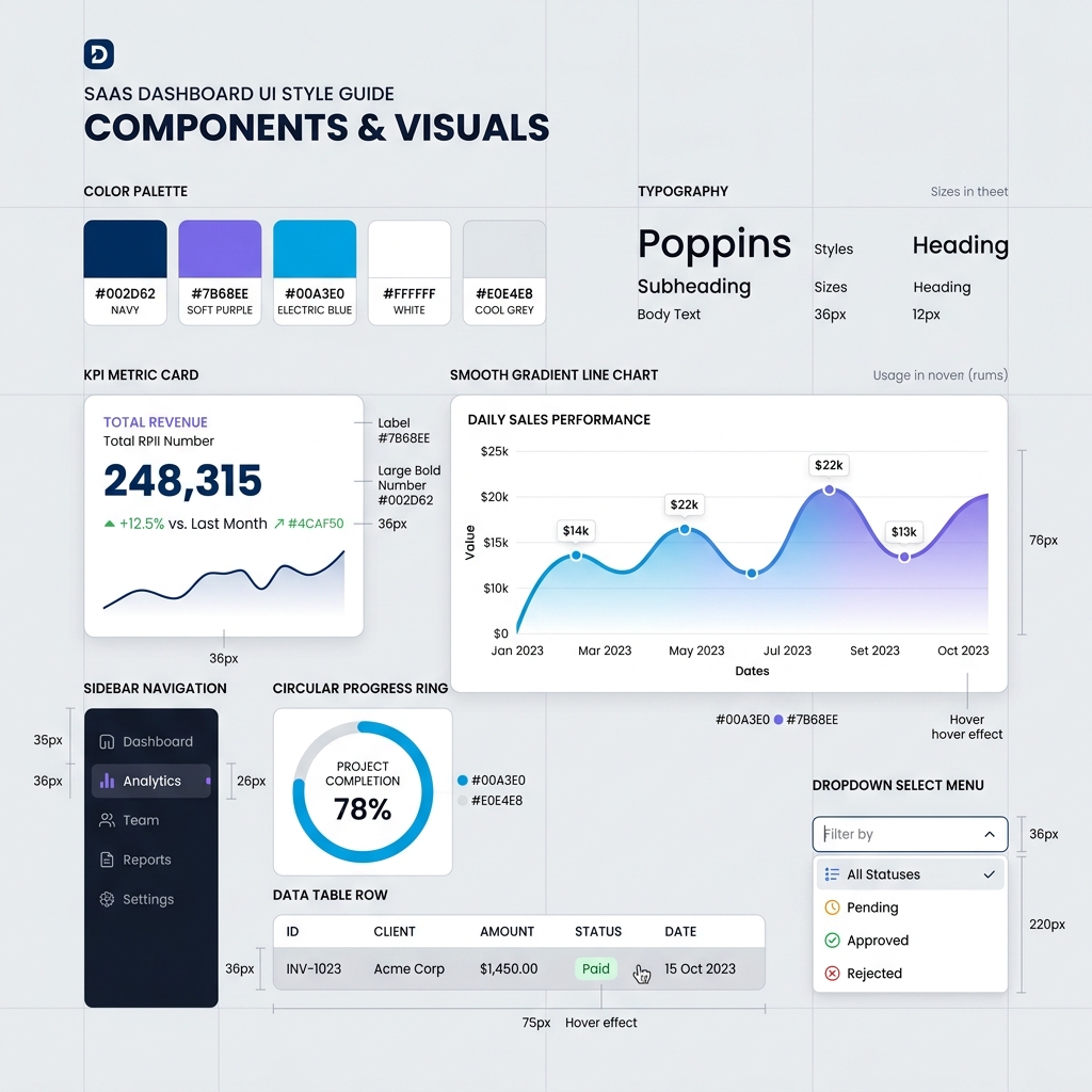
A UI style guide sheet for modern SaaS dashboard design. Light grey background with sample components: a KPI metric card with large bold number and small trend arrow, a smooth gradient line chart in blue-to-purple, a sidebar navigation with icon-and-label pairs, a circular progress ring, a data table row with alternating shading, and a dropdown select menu. Color palette shows navy, soft purple, electric blue, white, and cool grey. Clean, corporate, data-focused. 1:1 square crop.
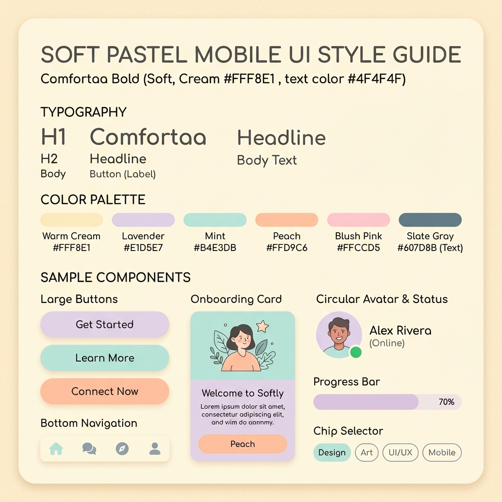
A UI style guide sheet for soft pastel mobile design. Warm cream background with sample components: large rounded rectangle buttons in lavender, mint, and peach, a bottom navigation bar with filled icons, onboarding card with a flat illustration, a circular avatar with status dot, a progress bar with rounded ends, and a chip selector row. Typography shows a friendly rounded sans-serif. Color palette is all soft pastels. Approachable, warm, gentle. 1:1 square crop.
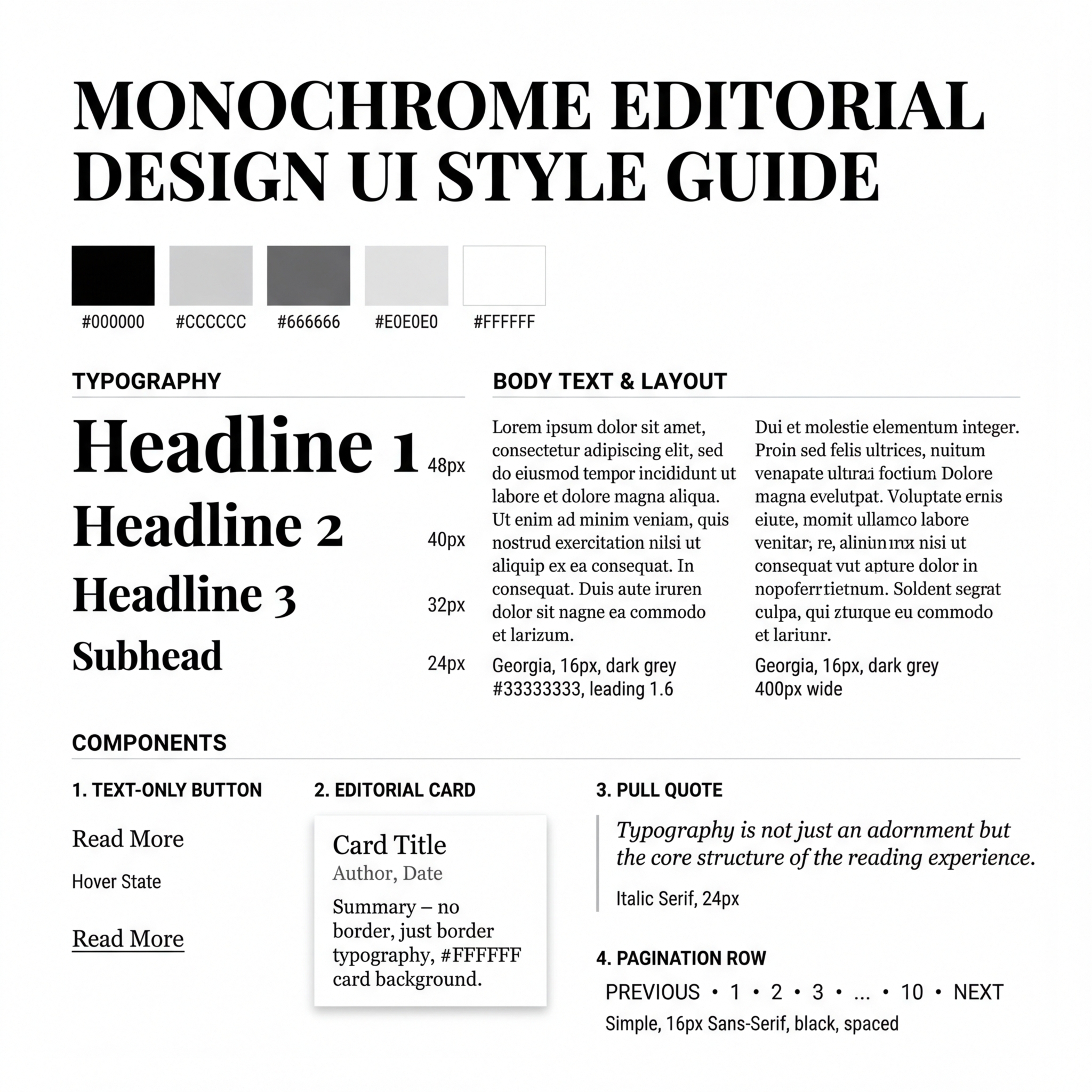
A UI style guide sheet for monochrome editorial design. Pure white background with components rendered entirely in black and grey: a bold serif headline in multiple sizes, body text in two column widths, a minimal text-only button with underline hover state, a card with no border and just typography hierarchy, pull quote with a thin vertical rule, and a simple pagination row. Color palette is just black, white, and three greys. Refined, typographic, print-inspired. 1:1 square crop.
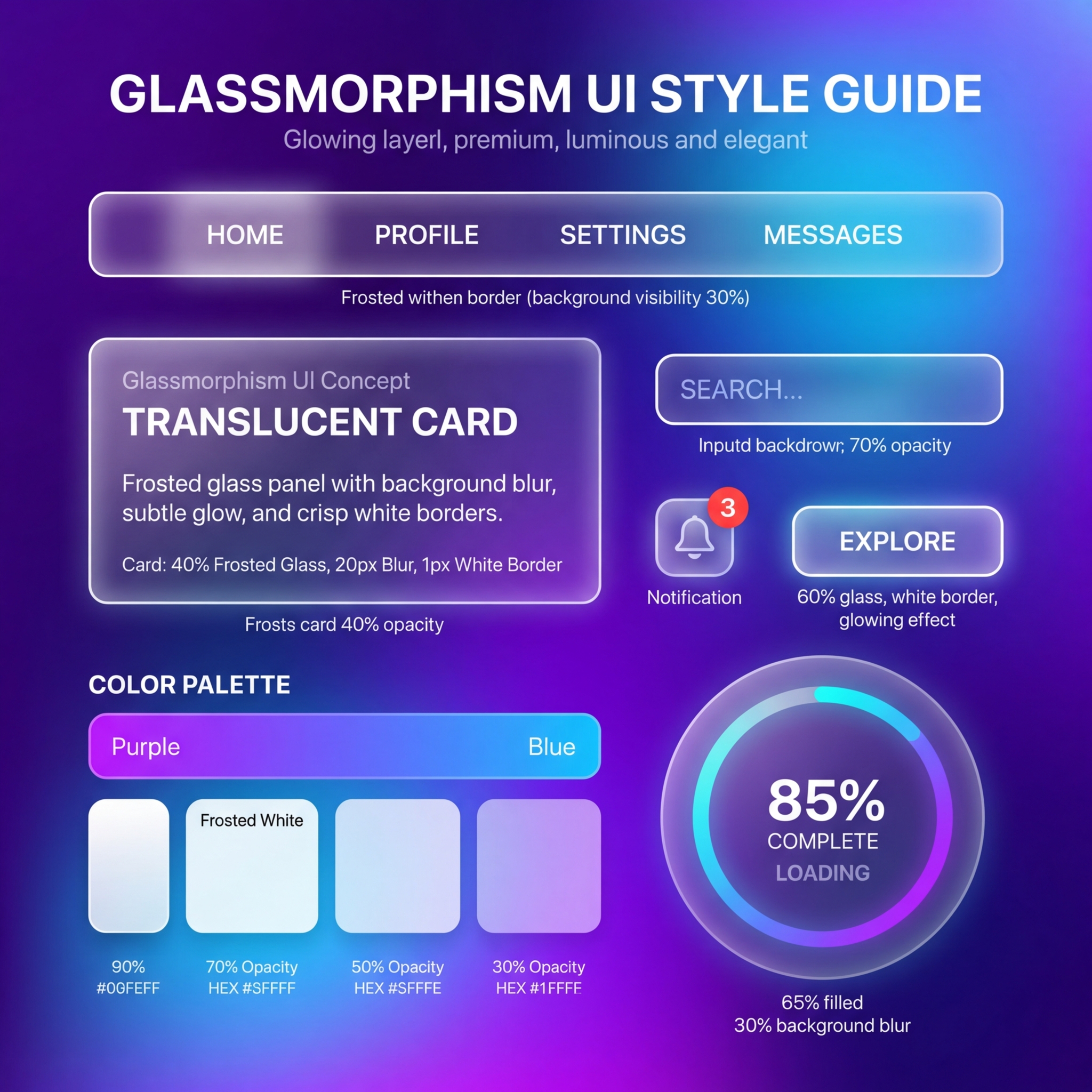
A UI style guide sheet for glassmorphism design. Vibrant gradient background in purple and blue with frosted glass UI components floating on top: a translucent card with white border and blur effect, a frosted navigation bar, a semi-transparent button with subtle glow, a progress ring on glass, a notification badge, and an input field with blurred backdrop. Color palette shows the gradient plus frosted white at various opacity levels. Layered, premium, luminous. 1:1 square crop.
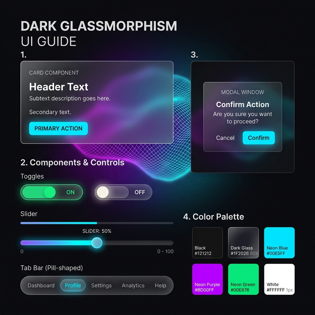
A UI style guide sheet for dark glassmorphism design. Deep black background with subtle colorful mesh gradient underneath. Frosted dark glass components: a card with thin white 1px border and 20% white fill, a toggle with glass track, a slider with glass thumb, a pill-shaped tab bar, and a modal overlay. Each component shows the background bleeding through at different blur levels. Color palette is black, dark grey glass, and accent neon tones. 1:1 square crop.
More prompts in this set (22)
A UI style guide sheet for colorful glassmorphism design. Background of large overlapping soft orbs in pink, gold, and teal. Frosted glass components arranged on top: a login form card, circular icon buttons, a horizontal scrolling card row, a floating action button, and a toast notification. Each component demonstrates a different opacity and blur intensity. Light refracts along edges. Color palette shows the orb colors plus frosted white variants. Dreamy, futuristic, layered. 1:1 square crop.
A UI style guide sheet for neomorphic design. Soft warm grey background with components that appear physically extruded from or pressed into the surface. Raised button with dual directional shadows, an inset text input field, a circular dial with soft pillow depth, a toggle switch that looks pressable, a progress bar in a recessed track, and a card that floats just above the surface. Color palette is monochrome greys with a single muted accent. Tactile, sculptural, quiet. 1:1 square crop.
A UI style guide sheet for light neomorphic design. Off-white background with softly raised UI components: a number pad with individually extruded keys, a volume slider in an inset groove, a segmented control bar, a raised icon button set, and a recessed display panel showing sample text. Every element casts two shadows — light from upper-left, dark from lower-right. No hard edges anywhere. Color palette is whites, warm greys, and one pastel teal. 1:1 square crop.
A UI style guide sheet for dark neomorphic design. Dark charcoal background with components that appear carved from the same dark material. Raised pill buttons with subtle highlight edges, an inset search bar, a circular progress indicator with soft glow, a toggle that sinks when active, and a card with barely-there elevation. Everything is the same dark tone with depth created purely by light and shadow. Color palette is dark greys with one muted amber accent. Moody, premium, monolithic. 1:1 square crop.
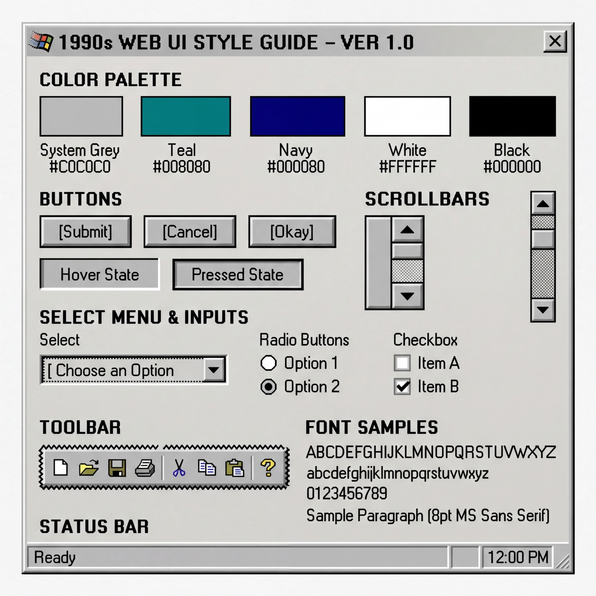
A UI style guide sheet for 1990s web design. Light grey background mimicking a Windows 95 dialog box. Components include: beveled 3D buttons in system grey with black text, a chunky scrollbar with arrow buttons, a dropdown select with sunken border, radio buttons and checkboxes in classic system style, a toolbar with pixelated 16x16 icons, and a status bar. Color palette shows the classic Windows grey, teal, navy, and white. 8pt bitmap font samples. Nostalgic, utilitarian, pre-CSS. 1:1 square crop.
A UI style guide sheet for early 2000s web design. White background with components from the Flash and table-layout era: a glossy aqua button with reflection, a tabbed navigation bar with rounded tops, a search box with magnifying glass, a breadcrumb trail, a star rating widget, a rounded badge counter, and a footer with tiny grey links. Color palette shows Web 2.0 gradients — aqua, orange, soft green. Lucida Grande and Verdana type samples. The glossy era. 1:1 square crop.
A UI style guide sheet for retro terminal design. Black background with green phosphor-style monospaced text. Components rendered in ASCII and block characters: a command prompt with blinking cursor, a text menu with numbered options, a progress bar made of hash marks, a bordered dialog box using pipe and dash characters, and a scrolling log output. Color palette is just black, green, and amber CRT glow options. Scan line texture overlay. Pure command-line aesthetic. 1:1 square crop.
A UI style guide sheet for Mac OS 9 classic design. Platinum grey background with components from the classic Mac era: a window title bar with horizontal stripes and close/zoom boxes, a menu bar with apple icon, radio buttons and checkboxes with chunky 1-bit rendering, a horizontal scrollbar with square arrows, an alert dialog with a caution icon, and the classic folder icon. Chicago bitmap font samples. Color palette is platinum grey, black, white, and highlight blue. 1:1 square crop.
A UI style guide sheet for brutalist web design. Stark white background with components that reject all decoration: a raw HTML link in default blue with underline, a plain black-bordered rectangle button with monospaced label, a text block set edge-to-edge with zero padding, a thick black horizontal rule, an oversized headline in condensed sans-serif, and a checkbox with default browser styling. Color palette is just black, white, and default link blue. No radius, no shadow, no gradient. Confrontational clarity. 1:1 square crop.
A UI style guide sheet for bold brutalist design. Bright acid yellow background with oversized black UI elements: a massive full-width button, a navigation list where each item is 100px tall, an input field with a thick 4px black border, a text block in enormous bold sans-serif, and a simple X close button. Every element is deliberately oversized and unapologetic. Color palette is yellow, black, and white only. Maximum impact, minimum polish. 1:1 square crop.
A UI style guide sheet for anti-design experimental UI. Hot pink background with components that deliberately clash and overlap: a rotated text block at 12 degrees, a button with mismatched border widths, overlapping card elements with mixed blend modes, a navigation menu running vertically in 8px type, and a cursor trail of geometric shapes. Color palette is neon green, hot pink, black, and electric blue. Intentionally broken grid. Art school energy as a design system. 1:1 square crop.
A UI style guide sheet for sci-fi HUD interface design. Black background with components rendered as translucent holographic elements in cyan and blue: a targeting reticle, a hexagonal button cluster, a thin-line health bar, a circular radar sweep, a data feed ticker in monospaced type, and a wireframe minimap. Everything has a subtle glow and scan-line texture. Color palette is black, cyan, electric blue, and warning amber. Transparent, floating, military-grade. 1:1 square crop.
A UI style guide sheet for retro CRT terminal design. Dark background with amber phosphor UI components: a flickering command prompt, a system status panel with blocky bar graphs, a toggle array of illuminated switches, a circular gauge with needle indicator, a scrolling log readout, and a radar sweep display. Visible scan lines and slight screen curvature effect. Color palette is black, amber, and dim green. Alien (1979) energy. Analog-digital, tense, operational. 1:1 square crop.
A UI style guide sheet for synthwave OS design. Black background with a neon grid floor fading to the horizon. Components in bright cyan and magenta: chrome-effect window title bars, a wireframe 3D object viewer, a file list in green monospaced type, a progress bar with neon glow, and navigation buttons with metallic sheen. Color palette is black, hot pink, cyan, chrome silver, and purple. 1980s vision of the digital future. All glow, all geometry. 1:1 square crop.
A UI style guide sheet for near-future cyberdeck design. Dark matte background with dense, functional components: a command line interface, a network topology graph with node connections, a matrix-style data waterfall, a thin warning alert bar in orange, an encrypted file list, and a system resource meter. Everything in monospaced font, no decoration, pure information density. Color palette is near-black, green terminal text, orange alerts, and white data. Hacker aesthetic. 1:1 square crop.
A UI style guide sheet for iOS 6-era skeuomorphic design. Linen texture background with richly rendered components: a glossy toggle switch with metallic track, a leather-stitched header bar, a button with embossed text and inner shadow, a page curl effect on a paper-textured card, a realistic slider with brushed metal thumb, and a segmented control with pressed-in active state. Color palette shows leather brown, linen cream, brushed steel, and iOS blue. Peak tactile digital design. 1:1 square crop.
A UI style guide sheet for rich skeuomorphic audio design. Brushed aluminum background with studio equipment components: vertical faders with rubber grip texture, LED meter arrays glowing green-yellow-red, rotary knobs with metallic highlights casting small shadows, recessed toggle switches, a VU meter with realistic needle, and an illuminated button with jewel-like lens. Color palette is brushed metal, matte black, LED green, warm amber. Photorealistic studio hardware rendered as UI. 1:1 square crop.
A UI style guide sheet for warm skeuomorphic stationery design. Wooden desk surface background with paper and leather components: a yellow legal pad with realistic lined texture and torn edge, a leather-bound notebook with embossed title, a sticky note with curled corner and shadow, a brass paperclip, a rubber stamp mark, and a wax seal button. Typography shows a handwriting font and a typewriter serif. Color palette is warm wood, cream paper, leather brown, brass gold. Analog warmth as interface. 1:1 square crop.
A UI style guide sheet for modern dark mode design. Near-black background with components in carefully calibrated dark greys: an elevated card at 8% white, a surface at 4% white, a primary button in vibrant blue, a text input with thin border, a switch toggle, a chip row, and a bottom navigation bar. Typography in white at 87% and 60% opacity for hierarchy. Color palette shows the dark surface stack from pure black to lightest elevation, plus one vibrant accent. Systematic, restful, OLED-friendly. 1:1 square crop.
A UI style guide sheet for cinematic dark dashboard design. Deep charcoal background with data visualization components that glow: a radial gauge with cyan glow, a gradient heat map strip from amber to red, a sparkline in electric green, a metric card with large white numerals and subtle border glow, a horizontal bar chart with multiple colored series, and a date range selector. Color palette is charcoal, near-black, cyan, amber, magenta data colors on dark. Command-center energy. 1:1 square crop.
A UI style guide sheet for playful illustrated app design. Warm cream textured background with hand-drawn style components: a chunky rounded button with thick outline and crayon-like fill, a card with doodle border, a search bar shaped like a magnifying glass, illustrated avatar placeholders, a progress trail of golden stars, a toggle with a happy face and sad face for on-off states. Typography in a bubbly rounded sans-serif. Color palette is warm primary colors — red, yellow, blue — plus cream and charcoal. Joyful, childlike, zero intimidation. 1:1 square crop.
A UI style guide sheet for pixel art gamified design. Light background with retro 8-bit style components: a pixel-art button with 2px blocky border, an experience bar with chunky segments, a coin counter with spinning pixel coin icon, a health-heart meter, a pixel avatar in a square frame, a level-up badge, and a dialogue box with pointed tail. Typography in a clean pixel font at two sizes. Color palette shows a curated retro palette — warm greens, sky blue, peach, and brown. Nostalgic, motivating, game-like. 1:1 square crop.